CLICK HERE FOR BLOGGER TEMPLATES AND MYSPACE LAYOUTS »

Final opening sequence 'Scarred'

Ugliest Jumper Ever - Preliminary

Tuesday, November 25, 2008

Reflections on the Test Shoot

We completed our test shoot on Monday 24th November. Overall i felt it went well and we achieved everything we set out to achieve. It showed us the areas which we needed to improve on in time for our real shoot and showed us the areas which worked really well and that we should definitely use in our real thing. The only aspect of our test shoot which we have still not yet achieved is deciding our final idea! We are still stuck between the two ideas because when it came to shooting them they both contained good and bad aspects and they both had lots of potential. Charlotte preferred the 2nd idea whereas me and Nisha preferred the first but as Charlotte is our actress we would prefer it if she liked what she was acting out. I think we will have to get feedback from as many people as possible and then the most popular idea we will go ahead with. 

The only criticism i had with our test shoot is the amount of times we managed to get distracted. For the time that we were there we found our selves loosing focus fairly often and this made our test shoot take longer than we had anticipated. For our real shoot i think this is the area that we need to work on the most because we are all such good friends therefore it is hard for us to not go off track a bit. I think we will set ourselves the target of working for solid few hours then our reward can be a small break where we are able to let off some steam and gossip otherwise i can see our shoot taking longer than we had hoped. 

Apart from that i feel the test shoot went extremely well and everything ran smoothly and according to plan. I am looking forward to shooting the real thing. 

Thursday, November 20, 2008

Group Work

Now that we have begun planning for our test shoot, i feel our group are working well together and all the individual research that we have all done has been a lot of good as it helped us come up with the 2 final ideas that we are going to be testing in our test shoot. We are up to date with everything and we communicate really well as a group so if there is a problem we can overcome it. Hopefully by the end of Monday we will have one final idea to go along with so we can begin working really hard on making it perfect. I am really enjoying the project so far and look forward to the rest of it.

Wednesday, November 19, 2008

Idea For Group Project

Once we had started planning our group project i went away and decided to come up with some ideas of my own to pitch to the group. I came up with a few but a narrowed it down to one final favourite idea and with this idea i decided to fill in the question sheet to show to my group in our next group meeting. Here it is:


  1. You see a girl leave her office and she begins to walk somewhere but we do not know where. The opening sequence will be the camera following the character to the place they are going and as it is in their POV the audience will only find out where they are going once they have arrived. The place they arrive at is a dingy, decrepit building with a young hostage tied up inside.

  2. The audience should feel scared, confused, suspicious, curious when they are watching this opening sequence. The main issues raised will be obsession, stalking, murder and revenge but these issues will only become apparent in certain parts of the opening.

  3. It is a real time sequence as the audience are seeing it through the characters POV so therefore it is happening whilst the audience are watching it. There is a small piece of dialogue right at the end of the sequence between the hostage and the woman when she enters the run down building. There will be a soundtrack and diagetic sound of the surroundings however the soundtrack will be played louder than the diagetic sound to create an atmosphere. I was thinking of having various cut aways to pictures of other girls or newspaper titles describing previous hostage victims which will make the audience think that the woman will be the next hostage victim when really she is the killer.

  4. Woman taking the journey-buisness woman, pencil skirt, white shirt, red hair, unattractive, middle aged, white, obcessive, murderer. Hostage - young girl, blood red lips, black eyeliner, smudged make - up, puffy eyes from where she has been crying, helpless, weak, short skirt, glittery top with blood stains on it, victim

  5. The sequence will take place in various locations as the woman is walking through a town and the camera follows her. The main locations that the camera focuses on are the dingy, run down, old building that is like a un used warehouse with very little light. It seems unhygenic and scary. The other location is the womans office which is like a state of the art, modern, glass, high rise building. It makes gives the impression to the audience that she is a professional buisness woman.

  6. The mise-en-scene changes as the sequence progresses. It goes from everyday lighting that is bright and sunny to dark eery lighting as she begins to walk down back alley ways and enters the horrible building. The overall visual style will be fairly normal that the audience will be able to relate to. It will feature shops and locations that the audience will be able to recognise and so therefore it will seem realistic but as the scene progresses the locations will become more unrecognisable and unnormal and the audience will then begin to suspect something. The dress codes will be a typical buisness woman's dress code with the pencil skirts and fitted shirts. The young hostage will be dressed like a typical teenager on a night out somewhere making it more relatable to the audience and therefore more chilling. The people that she encounters on the street will be dressed like an average person making the scene plausable. The mise-en-scene is trying to build up tension by moving from normal, average day surroundings to more unusual, frightening, distrubing ones and the audience will notice these changes and therefore become scared and confused.

  7. The camera will mainly be in the POV of the person walking therefore the movement of the camera will mimic the movement of the camera using tracking as if she is walking forward and whip-pans and pans to show the movement of her head turning etc. This will therefore mean there will be a range of shot distances and angles. Occassionally there will be cuts where we see the scene as if we are on lookers but these shots will only be brief and they will mainly be MLS and LS to act as establishing shots so that the audience get a sense of the surroundings.

  8. It will be a continuous sequence with a few examples of cross cutting between the main action and shots telling the background behind the main action (polaroids and newspaper titles). I will try and show off my knowledge of continuity editing as much as possible with the sequence by using match on action, shot-reverse-shot, eye line matchs and the 180 degree rule.

  9. Yes, a few of the questions are maybes but once i have presented my idea to the group we can adapt it to make it more suitable. It is just a starter idea that we can build up and create other elements around it.

  10. They liked the idea but they felt it would be too complicated to shoot as the weather is unreliable and due to there being a large amount of people on the streets the continuity would be difficult to get right. They felt that if we had longer to shoot it and our sequence did not have to be 2 minutes then maybe we could of gone ahead with it and worked on it further but due to the lack of experience we decided for a student film it was too complicated and difficult to do.

Thursday, November 13, 2008

Groups for Coursework

We have now been told what groups we are going to be in for our coursework so we can now crack on with working on planning our opening sequence. I am happy to be working in a group with Nisha and Charlotte as they are two of my closest friends and i get on well with them. We have already arranged to have a few movie nights to do some research which should be good fun and i am looking forward to it. I am just worried we might spend too much time gossiping and having fun rather than working though but hopefully this wont happen. We all know when the talking should stop and the work should start! Anyway let the planning begin...

Saturday, November 8, 2008

Preliminary Exercise

Here is our final sequence for our preliminary exercise that goes with the evaluation questions. I really enjoyed making this sequence as it was much more challanging and professional than we had ever done before. I hope you like it :)

Friday, November 7, 2008

Analysis of A DVD Cover
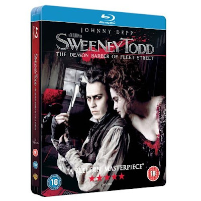
DVD covers do a huge amount to market a film and entice the audience to watch it. If the cover for a film did not create a story that the audience need to watch the film to answer or did not seem interesting then the audience would not feel the need to watch the film. It is the first thing the audience see when choosing a film and it needs to grab their attention for them to notice it amoungst the many other DVD covers. If the audience did not get a chance to watch the film when it first came out in the cinema, then it needs to be the DVD cover that encourages them to watch the film. It is therefore extremely important to get the mood and feel of the DVD cover correct in order to draw in the correct audience and to market your film successfully.


This is the DVD cover for the successful Tim Burton movie Sweeney Todd: The Demon Barber of Fleet Street. I feel that this DVD cover sells the film really well and makes the audience want to watch the film to find out what its about.
You can immediately tell from this film cover that the genre of the film is horror. This is shown by the dark and depressing background in contrast to the paleness of the actors' skin. The razor blade in Johnny Depp's hand is also an indicator that the film is going to be a horror as it is shown to be a significant object in the image as he is holding it up and a sharp object is normally associated with murder. The blood splatter at the top of the cover across the writing also indicates to the audience that the film is from the horror genre as a blood splatter is related to death and killing and as it is so dominant and noticeable in the image, we know it plays a big role.
The image is quite sinister and scary looking. Johnny Depp is directly addressing the camera in a menacing way and the surroundings seem very mysterious, derelict, dark and eery. The red barbers chair is also very creepy as it is a huge contrast with the rest of the background and it looks very derelict and dirty, as if it has been through a lot. The fact that it is blood red is also a signifier to the audience of what is to come as many people's blood gets spilt on the barber's chair as he murders them on it. The image as a whole grabs the audience's attention as it is so extreme and makes them want to watch the film because it creates a sense of mystery that they want answered.
The audience are able to tell the age rating for the film from the front cover of the film as the '18' certificate sign is shown on both sides of the cover. This makes sure that audiences know the age that they have to be in order to watch the film to avoid any confusion that could be caused. It immediatly singles out the audience that are allowed to watch the film from the audience that are not, therefore picking out their target audience.
There is a quote at the bottom of the cover saying "A Bleedin' Masterpiece". This encourages audiences to watch the film because they can trust another persons opinion and if it has been critically acclaimed then it must be a good film. It acts in the same way as word of mouth endorsement, the audience want to be talking about the film as well and be able to give their verdict. They want to watch the film so that they can either agree with the person's verdict or disagree and find out why they are so enthusiastic. They do not want to feel like they are left out.
The 5 stars across the bottom of the DVD cover entice the audience to watch the film as well because they can tell its been given a high rating, therefore it must be a good film. It will make them want to watch the film to see whether they agree or not and to find out what is actually so great about this film.
Johnny Depp directly addressing the audience draws in the audience as it makes it seem as if he is looking at them, therefore involving them in the movie. It will make them feel special and so they will be more inclined to pick up the film and watch it. Helena Bonham Carter is looking lustfully at Johnny Depp. It is connoting to the audience that she is maybe in love with him and willing to do anything for him. He seems like the domineering figure and she is just his loyal follower, like a love struck puppy dog. It makes you want to watch the film to find out exactly what their relationship to each other is because from the image it seems as if it plays a big part in the story.
The audience can tell who the main characters in the film will be from the front cover, either drawing them in or putting them off. From this image we can see that the main storyline will revolve around Johnny Depp's character and Helena Bonham-Carter's character. We can tell clearly that these two actors play these characters so therefore fans of these two actors will be more inclined to watch the film. Also people who have seen previous films from these two actors will be more likely to watch the film because if they liked their previous work then they will think they will be more likely to enjoy this film as well. However it could also work in the opposite way. If the audience do not like Johnny Depp or Helena Bonham-Carter, or have watched previous films with them in them and hated them then they are more likely to not watch this movie from the DVD cover.
The silver, blocky writing reflects the shine and cut of the razor. It ties in well with the image and anchors the fact that the razor plays a big part in the storyline. It grabs the audiences attention as it is quite a dramatic, meaningful style of writing that matches the whole mood that the film is trying to set up.
The cover tells us the film was directed by Tim Burton as written above the title it says 'A Tim Burton Film'. As he is a well known, successful director the audience can make the decision of whether to watch the film from his reputation. They can look at other films he has been involved with the directing of and decide whether they liked them or not and therefore base their decision of whether to watch this one on their other encounters with him as a director. He is well known for being a fairly quirky director so therefore it tells the audience before they watch the film that it is going to be edgy and different so they should not expect something too conventional as Tim Burton is renowned for taking risks. 
Johnny Depp's name is written in big writing at the top of the DVD. His name markets the film because he is a likable, established Hollywood star and if people know that he is in the film then they get the feeling that the film will be good because he would not be seen in a bad film as it would ruin his reputation. It gives the audience a sense of security because they can feel that if he was willing to put his name to it then it must be watchable. Also Johnny Depp draws in a fairly wide audience as people would watch the film just because he is in it as he is said to be one of the most good looking actors of all time and he has such a huge fan base, both film lovers and haters. This would mean that a bigger audience would want to watch this film rather than just its target audience because they will see that Johnny Depp is in it and want to watch it for that reason, rather than for the story-line. In a way his name is marketing the film and selling it to the audience.  

Preliminary Exercise Questions

What Have You Learnt From From Completing This Task? Looking Ahead, How Will This Learning Be Significant When Completing The Rest Of Your Foundation Coursework, Do You Think?
This preliminary exercise helped us practice using our skills and allowed us to make mistakes this time round so that we can avoid these errors when it comes to the real thing. It has helped us learn a lot of things that we never thought were relevant before when shooting, planning and editing. 
When we were shooting our sequences i learned that you had to shoot it in the most convenient and efficient way, not the way that your shots are going to appear in your final sequence. Before we carried out this task i never knew this is how a sequence was shot, instead i thought it was shot in the order it appeared on a story board, so making a shooting script and shooting in a different order was all new to me. However this has helped me to learn for the final project and i will hopefully be more confident about doing it. 
Thinking about the continuity of our sequence was also all new to me when carrying out this task. When making past video sequences the shots were random and did not have to be in a certain order or make sense to the audience. When carrying out this task i found out just how hard it was to keep the continuity of the sequence correct and we had to shoot each shot a large number of times because when watching them back we found lots of errors with the continuity such as poor matches on action and bad eye line matches. Doing this task has helped me notice things like this more so that when it comes to our real coursework project i will be able to spot these mistakes and correct them more quickly rather than it being extremely time consuming like it was in this exercise because we had never taken these things into account before. 
When it came to editing our sequence, a lot of the dialogue was hard to put into the shot reverse shot sequence because the pauses between one actress speaking and the other one answering her was too short, therefore we had to be very careful when it came to cutting the clips otherwise we could of lost half the dialogue and therefore ruin the continuity. This was a very time consuming process and when working to such a tight schedule was very difficult to do so we ended up rushing it. When it comes to making our real film opening i have learned that in order to make this process easier we should leave longer pauses between one persons line and another persons line so that when cutting the clip it can be done more easily and will therefore look more natural and flow better, making the continuity of the sequence more professional. 
A lot of our shots could not be used due to various problems with the continuity, sound or framing that we only noticed when it came to editing our sequence together. This has made me learn that we have to shoot a shot more than once otherwise if we miss an error with a particular shot while shooting, if we later discover that error and are unable to use it we do not have to go back out on location and re shoot it again, we can just use one of the other shots we shot on the day. This would not only be better for the time schedule but also the continuity of our sequence because it is harder to get something to look the same several days after. 
I have learned that managing your time is also extremely important during the process of shooting, planning and editing a sequence. We had to anticipated that getting our sequence just right would take so long therefore we ended up being slightly rushed for time towards the end. When conducting our real piece of coursework i would therefore plan my time a lot better and allow time for correcting errors and re-shooting which we had not planned for. I also have a better idea of how long it takes to construct a sequence therefore i will not be too ambitious as i know now that it is far more complicated and time consuming than i had originally thought. 
I learnt during this project the importance of being able to adapt to problems and situations. During our shoot we had to adapt to many things due to the disruptions in our locations and lack of time and space. When carrying out the final coursework i will know that the best thing to do when encountering a problem is not panic and waste time worrying, instead just think of an alternative that will work just as well and therefore adapting is much more beneficial in the long run, although it may seem a nuisance at the time. 
Overall this project has helped me to gain the confidence to feel positive about moving onto our coursework project. I have learned many beneficial things from this exercise and i can carry this knowledge through to the main project and therefore hopefully create something more successful. I feel that from this exercise i can progress forward and learn from my mistakes that i have made in this project so that my main one will be fault less. It has really been a useful exercise and helped me understand the processes of making a sequence a lot better so that making the real thing will not seem as daunting or as big a challenge. I now feel i can tackle it optimistically. 

Preliminary Exercise Questions

How Successful Was Your Sequence? Please Identify What Worked Well and With Hindsight, What Would You Improve/Do Differently?

Brief:-Continuity task involving filming and editing a character opening a door, crossing a room and sitting down in a chair opposite another character, with whom she/he then exchanges a couple of lines of dialogue. This task should demonstrate match on action, shot/reverse shot and the 180 degree rule.

I feel we completed the task successfully as we kept to the brief and did everything that it stated we should of done. Our sequence contained a girl walking into a room and opening the door to do so, which contained a match on action, two gossiping girls exchanging dialogue seen in a shot reverse shot, and we stuck to the 180-degree rule as we kept on the same side of the characters throughout. 
When watching our sequence back it does all seem to flow fairly well and fits together almost seamlessly. All the matches on action work really well and the shot reverse shots and reaction shots seem realistic and plausible. When watching it you cannot notice the edits and it just looks like one continuous piece of footage which is what we had hoped to achieve. The shot types were all what we had intended them to be and we pretty much followed our storyboard as much as possible showing our idea worked just as well on paper as it did in reality.
The sound was also really clear and you can understand exactly what the characters are saying throughout. It does no in corporate too much of the background noise but allows the audience to hear enough for them to understand what is going on around the characters, for example the keyboard typing and the door opening and closing. 
The establishing shot at the beginning show where the characters are in relation to each other so that further on in the sequence we do not get confused. However the establishing shot at the beginning was supposed to be after the shot of actress two walking through the door and it was supposed to be a slow pan from actress one typing to actress two walking through the door so we could see the distance between the 2 characters and the location but because the shot before this one showed actress two already having come through the door it did not make sense when it was put in the sequence. Therefore we thought it was more plausible to have just a still shot of actress one typing at the beginning to show where about in the room she is in relation to the door and then continue with our original sequence. It was not our intended establishing shot but we still felt it worked well and made sense to the audience. 
I feel that in the shot where actress one says 'What's up?' and then it cuts to a shot of actress two standing by the door about to pull up a chair there is too long a pause between the end of the action in one shot to the start of the action in the second one. It seems unnatural and unrealistic. It creates suspense in the sequence because it takes longer for us to find out what is going to be said but at the same time i think it holds it for just a bit too long and it makes it seem as if they are waiting for the director to shout cut or action. It does not have the pace that the rest of the sequence has making it stand out and not seem to flow as nicely. 
The reaction shot towards the end of the sequence where actress three walks through the door and actress's one and two react to her coming in was a lot shorter than the original shot we had intended to use and the sound was moved to this one from another shot to make it make sense and fit with the rest of the sequence. This was because in the original shot the actress's take far too long to react to the sound of the door and therefore it looked staged and set up. It did not seem as if they had been interrupted mid conversation but instead had been sitting in silence for a long period of time which is not the effect we had hoped to achieve. However when we cut the shot down to make their reactions a lot faster and not have so long before the action begins, we lost a huge chunk of sound which involved the sound of the door opening. Without the sound of the door the reaction shot would have not made sense as they would not have been reacting too anything and the audience would not have been able to understand it. So in order for us to make this shot make sense we had to work with the sound and the clip as two separate things and cut them to the appropriate lengths separately. We then had to group them together again in a way that did not look like the sound had come from a different part of the original shot. The outcome looks plausible but it took a lot more effort and work to make this shot work than we had originally thought or planned for but if we had not done it, the continuity of our sequence would of been effected. 
In the shot that showed actress two saying her dialogue to actress one we had to shoot the shot many times due to actress two moving around to much and therefore her head being cut off in the camera and the framing of the shot being affected. We did 12 takes of this but there was only 1 take that had her sitting still enough for her to still be in the camera when she was talking. This meant that we had to use this shot and we did not have a choice although it was not the most perfect shot for the continuity or the dialogue that was said. Some of the other takes of this shot would of worked better with the continuity of the sequence but we could not use them as they contained too much movement. If we were to redo this task i would have shot that shot more times until we had a range of takes where she did not move and therefore we would of had a variety of shots to choose from. However due to the amount of time we had to shoot or sequence we did not have enough time to do this so we ended up just getting one take that we were able to use. 

Thursday, November 6, 2008

Preliminary Exercise Questions

What Factors Did You Have To Take Into Account When Planning, Shooting and Editing?

Planning:-When planning our shoot we had to take into account the amount of time we had to do it, the budget, the locations available to us and the weather. It stopped us from planning an idea that was too complicated and unachievable as we knew we only had 1 hour to shoot and 1 hour to edit so we could not plan a long sequence. Also we were only allowed to shoot within the school premises so we had to plan for a shoot that used a location within our school otherwise it would have been impossible to do. Budget was also a big issue because as we had no money to work with we could not plan something extravagant as it would not have been possible to do with no cash to buy props and hire professional actors etc. Weather also played a big part when it came to planning our shoot. If we were planning on shooting outside it may not have been possible on the day due to poor weather conditions so we had to find a way round that and instead planned our sequence so that it all took place indoors. Also the weather could interfere with the continuity of our sequence so when planning we felt it would be a safer option to just plan a shoot with an indoor location so that weather would not effect it.

Shooting:-When shooting we had to take into account the continuity of our shots, the shot types, the lighting, the sound and certain disruptions that may have been occurring in the locations we were shooting. If we were shooting one sot to match up to a following shot we had to make sure the actors were in the same position, wearing the same clothes, had the same hair and were in the same location that looked the same to the previous shot otherwise our sequence would not have been plausible and the continuity would have not been successful. In order for us to do this we sometimes had to carry out the shot several times. We also had to make sure we had the correct cutting points on our shots and that the shots we had intended to shoot were actually being shot. This involved working out the framing of each shot through the camera viewfinder before actually shooting the shot. We had to make sure that each shot was lit correctly and clearly so that there were no dark shadows hiding the actors or bright, blinding beams of light that looked unnatural. We also had to check that the brightness of the lighting did not differ from shot to shot otherwise this would have effected the continuity of our sequence. When on set we had to make sure that the actors dialogue could be heard clearly, despite any outside noise that could of interfered with it, otherwise each shot would of been pointless as we would of not been able to hear what they were saying or understand it. When shooting in certain locations there were other things taking place around us at the time for example people coming out of lessons and other people shooting their footage. We had to adapt to these disruptions and maybe change our intended location or shot type to avoid them. Without this improvisation the disruptions could of ruined the sequence and made it seem unprofessional and messy. 

Editing:-When editing out sequence the main facto we had to take into account was the continuity. We wanted our shots to fit together seamlessly and not let them look as if they have been shot separately or do not make sense or are confusing for people to watch. Where out shots were cut and the order we put them together in were the two main issues involved with the continuity of our editing. 

Preliminary Exercise Questions

What Technology Did You Use To Complete The Task, and How Did You Use It?

In order to carry out this task we used carious types of technology. The main thing we used was a Mini DV Canon camera to shoot all our footage. We used the same camera throughout to make it less complicated and difficult and to be sure the camera would not ruin the continuity of our sequence.
Another piece of technology that we used was the software we edited our footage on called Premiere Pro. It allows you to edit video sequences quickly and easily, ideal for us as we were working to a tight schedule. We used non-linear editing when using this program which meant we could move clips around and we did not have to edit in a particular order. It allows the process of editing a lot easier and versatile. During this process we used 2 video tracks to allow us to see where shots begun and ended more easily as we alternated what tracks they were on and we used 1 audio track as the only bits of sound we had were the surrounding sounds and the dialogue meaning we only needed one track.
In order for out sound to be as clear as possible we used boom microphones. They emphasize the sound and therefore make the dialogue in our footage more easily understandable.
When shooting we also used things such as tripods to keep the camera steady and avoid shaking, a white board to note down what shot number and take we were filming to make it easier for us when it came to editing and headphones so that we could hear the sound that was being recorded and makes sure it sounded clear and accurate enough.
I found using all the equipment was easy enough as we had used it before in past projects and we had had time to practice with the camera in previous lessons. It just took a bit of recapping to get the hang of it again but once we had done that it was all fairly simple and straight forward.

Wednesday, November 5, 2008

Preliminary Exercise Questions

How Did You Plan Your Sequence? What Processes Did You Use?
We each were allocated with a task involved in the planning of our sequence so that everyone would be equelly involved in the process. We first of all discussed our ideas as a group and discussed appropriate actors, location and plot, then once we had roughly written down and story boarded our best idea we each went away and did our bit.
Shaun created a storyboard for our sequence so that we could see visually how each shot would look and how well they would fit together. It would give us a feel of how the sequence would flow when it is put together and it would help us decide what would be an appropriate order for our shots, in order to make the continuity correct.
Amelia and Mia then went on to construct a shooting script once we had decided on our shots and storyboarded them. This helped us find an appropriate order for our shots to be shot in so that it would take up as little time as possible and work most efficiantly. The shooting script was not the order that our shots would finally be put in, just an order that would make it easier and less time consuming as shooting the shots in the order they are storyboarded would take up too much time and there would be far too many mistakes involved in the continuity.
I then went away to write the script for our sequence. This would help us when it came down to the continuity of the sequence as the conversation shots would have to be shot a number of times and in order for us to be able to do effective continuity editing we would have to keep the dialogue the same.
We did a few run throughs of the sequence before it was shot just to make sure the actors and location were appropriate and worked with the plot. This would help prevent any problems that we could of come accross during shooting and gave us a chance to resolve them then and there.

Preliminary Exercise Questions

Who Did You Work With and How Did You Manage the Task Between You?
My group consisted of Amelia, Mia, Shaun and me. We allocated everyone with different planning tasks so that we would all contribute an equal amount to the planning of the sequence. The camera work was mainly done my Mia and Shaun as Amelia and I were involved with the acting. We felt that this would be the easiest and most efficiant way of taking our shots rather than changing the roles every shot as it would have been very time consuming and we were under a strict time limit. With the editing we circulated it between the group, everyone doing 15 minutes of editing and people chipping in with ideas and help when people needed it. We found that this was the most effective way of doing it.
Overall i felt our group worked well together and we all pulled our weight to get the job done. There were no arguements or disagreements and everyone was willing to do the jobs they were given.

Tuesday, November 4, 2008

Legally Blonde Opening Sequence

An opening sequence is the first part of your film that the audience see. It should captivate the audience and make them want to watch onto the rest of the movie. An opening sequence should set up the location and time, introduce the audience to the main character(s), contain music that is relevant to the film, set up the genre and future themes of the film, contain a few important credits, introduce the storyline, establish the key iconography, and set the pace of the film. If an opening sequence does all this it is highly successful, however it does not always have to contain all of these aspects for it to be a good opening sequence.
The 2001 film 'Legally Blonde' has an opening sequence that engages the audience and allows us an insider into the life of the main character. It is a fairly short sequence but in that space of time it manages to tell us a lot about the main character, the location and the general mood of the film. It sets it up to be a chick flick from the very beginning and introduces us to the storyline therefore living up to the audiences expectations and making them want to watch on.

The music is very happy and jolly and anchors what is going on on the screen. The lyrics 'Its a perfect day' are shown by the sunny sky, beautiful people and the main character getting ready for her boyfriend. It is emphasised by the use of high key lighting which makes everything seem far more perfect than it may be. The audience immediately know that the 'perfect day' is related to what is going to happen with the main character and her boyfriend as that is what the entire opening is leading up to, as that is what the card she is given is for.
The whole opening sequence is following the card that is being delivered to the main charcter. This is how we find out that the main character's name is 'Elle' as it is written on the envelope. The card starts off in the basket off a bike with a girl riding it through the town. The camera passes by many serorities and we get the feel of a typical American teenage community that is friendly and perfect. The bike rides into a serority called 'Delta Nu' and we know from this that the main character must belong to this serority. The camera then cuts to show Elle's dressing table with a mirror on it saying 'President'. The audience link the two and assume that she must be the president of the Delta Nu serority and therefore must be important and loved. We then follow the card through the serority showing all the good looking girls doing their makeup after showering and keeping fit. It is what the audience would expect to see from a very girlie serority and therefore it sets the scene up and lets the audience know that it is going to be an extremely feminie film.
There are many shots of Elle's belongings telling us a lot about the character just from what she owns and what the camera is showing her doing. We do not see her face until the very end of the opening sequence, however, from all the shots before this we can guess she is going to be a very made-up, stunning, blonde girl. This is because there are many establishing shots of her things such as nail varnish bottles, herbal essesnces hair dye, fluffy pens, glittery picture frames, fashion magazines, pink shoes, heart jewelry, Prada shopping bags etc. These shots all connote different things to the audience but the main thing it tells us about Elle is that she is the stereotypical blonde girly girl. The shopping bags tell the audience that she is a big fan of shopping and the fact that they are Prada tell us that she is wealthy and likes to shop designer wear. The nail varnish and various make-up products placed on her dressing table show that she is a very self-indulged character and she cares a lot about the way she looks. She obviously likes to be well groomed and this is anchored by the fact that in many of the shots of her she is indulging in her beauty regime which involves shaving her legs, painting her perfect nails and brushing her hair. There is a close up shot of a sash in her room saying 'Homecoming Queen'. This signals to the audience that she was homecoming queen at high school and therefore must be very popular. The picture frames on her desk show pictures of a chihuahua dog dressed in clothes. We can assume that this is her dog otherwise it would not be in a picture frame on her desk. It is something that a typical American blonde such as Paris Hilton would do with their dog and shows that she maybe aspires to be like that. It shows she is extremely girly and also loves her animals.
The first shot is a CU of her blonde hair swishing which immediatly ties in the tital of 'Legally Blonde'. It is an effective opening shot because it introduces the important part of the main character and therefore the storyline without giving anything else away. It is eye-catching and different and as it is the first shot the audience know that the blonde hair plays a big part in the role of this film.
Towards the end of the opening sequence you hear the main character talking on her phone and then see her opening her card and blowing a kiss to the picture of her boyfriend. The audience can assume that she is gossiping from what she is saying which is a very sterotypical girly thing and her tone of voice and actions show that she is ditzy and feminine, very much like what we would have expected to see leading up to it. The way she blows her boyfriend's picture a kiss shows that she cares a lot about him but also shows the audience that she is still young at heart as not many adults would do this. It therefore shows she is innocent and some what naive, setting us up for what is to come.
When Elle opens the card the audience get an insight into what all the fuss is about. We find out that Elle is getting ready to go out with her boyfriend, Warner, and so therefore something big must be about to happen. However the audience get the impression that everything is too good and perfect to be true and we can foresee something bad that will happen on this date.
The font used for the credits is pink and swirly, with hearts as dots for the 'i''s and very calligraphic joined up lettering. This emphasises the fact that the movie is very feminine and girly. It almost looks as if the writing of an American girl next door and therefore the audience can link this writing with the main character, Elle, and therefore anchor the fact that she is very fun, bubbly and a typical girl.

The audience find out all these elements from the way the opening sequence is shot and put together. Without it the story would be far more confusing as we would have never had the establishing shots introducing us to various things and giving us some background information, we would have just been thrown straight into the story and made to guess what was happening. This is why opening sequences are so important as they set up what the film is going to be for the audience and lets them know what is to come.

Sunday, November 2, 2008

Diegetic and Non-Diegetic Sound in Movies

Sound is used a huge amount in movies to create a certain atmosphere for the audience and to make scenes in films seem more realistic. There are two types of sound used in films and these are diegetic and non-diegetic. Diegetic sound is sound from the movie world, for example, a door closing or a train passing by. Non-diegetic sound is sound that has been added on after to create a particular effect, for example, a soundtrack or voiceover. Both are found in almost every film and they are often used together as they both create different things. It would be strange for the audience if both types of sound were not used in a film, diegetic because it would make the situation seem surreal as the sounds you would expect to hear in that place would not be occuring and non-diegetic because the the music normally signals what the audience should be feeling or what a particular character is feeling and without it it could become slightly confusing and uninteresting. Here are some examples of how sound is used in various well known films:
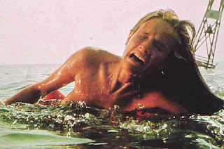
Jaws- Opening Scene:
Diegetic - A lot of the sound where the party is taking place is diegetic sound. The man singing with his guitar, the sound of the crackling fire, the sound of the teenagers laughing and joking are all examples of the diegetic sound used.
When the girl is in the water and Jaws begins to attack her, you hear a lot of splashing and the sound of water lapping at the shore. These are other examples of diegetic sound as they have been placed in the movie to make the scene seem more realistic as it is what the audience would expect to hear in a situation like that.
Non-Diegetic - The famous soundtrack that is used throughout the JAWS movie to signal that the shark is coming is an example of non-diegetic sound. It does not actually take place in the movie as the characters cannot hear it yet it has been put on afterwards to make the audience feel scared and to create suspense as we know that sound to mean danger and a scary shark. In the opening scene the music begins to play when you are in the POV shot of the shark underwater before it attacks the teenage girl showing that it is something that relates to the shark and it acts as a warning signal to the audience.

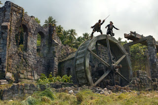
Pirates of the Caribbean: Dead Man's Chest - Fighting for the Key Scene
Diegetic - Throughout the whole scene the sound of swords is heard a lot as that is what they are using to fight. This is diegetic sound as the sound relates to the action taking place on screen and the swords would really be making that sound in real life when they are being used to fight.
Other types of diegetic sound used are the sand on the beach, the bushes in the forest, the sound of cutting through objects such as flesh and rope, the sound of breaking wood, the metal beam hitting Jack on the head, the falling key, and creaking wood as these are all sounds which appear in the movie world and that the characters would be able to hear along with the audience as they take place because of the things that occur on screen.
Non-Diegetic - The entire scene features a piece of music that sounds fairly epic and dramatic. It fits with what is going on on screen but yet it is only there for the audience's benefit as the characters cannot hear it making it non-diegetic. It creates tension and suspense with the deep, rumbling drums and string instruments and as the pace and nature of the action changes the music changes along with it. This is parallel music as the music fits with what is going on on screen and the emotions it creates are the emotions you would expect to be having when watching what is on the screen.
It continuously repeats the motif of Pirates of the Caribbean which is instantly recognizable to the audience. It is this music that the audience can associate with Jack and his fellow crew involved in some kind of heroic action and so can immediately know that this is what is about to happen or is already taking place on the screen. It acts as a link between the pirates world and the real world as the audience can relate to it and it is a piece of music attached to Jack and his crew. It reminds the audience what they are watching and makes the audience feel as heroic and pirate like as Jack himself.

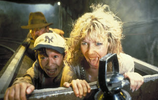
Indiana Jones and the Temple of Doom - Mine Cart Chase Scene:
Diegetic - It is used a lot during this scene to make the action seem more plausible to the audience. The sound of the gun shots, the car screeching along the tracks, the sound of people being hit, the sound of falling wood, the sound of the mine cart whizzing along the tracks and the gushing water are all examples of where diegetic sound has been added to create a realistic effect. Without them the audience would be feel as if part of the action is missing as they all add to the overall film and grab the audiences attention the same way the visuals do. It tells the audience what is going on without them having to watch the screen. Each individual sound matches up with an action and they are all easily recognizable sounds to the audience.
Non-Diegetic - Throughout the whole sequence there is background music to create an atmosphere and to build up tension and suspense. The pace of the music is quite fast reflecting the speed of the mine cart and as certain things happen on screen the music mimics it, for example, when the camera cuts to another cart following theirs the music goes into a panic itself and becomes faster, more high pitched and uses only a few notes as if expressing the desperation of the main characters and the audiences emotions. It is a parallel use of music as what is on screen matches what the music is doing and creates the same effect as the visual image. It is almost telling the story through the use of music.
If you listen closely parts of the music play the iconic motif of the Indiana Jones film reminding the audience that they are watching an Indiana Jones movie and that in the end he will come out heroic and succeed no matter what obstacles he has to face. It reassures the audience that despite the danger he is facing we have to remember that he is Indiana Jones amongst all this chaos and he can deal with it.


As you can see music plays a big part in movies to create a certain atmosphere, mood or realistic event. The audience are so used to hearing music in films nowadays that we take it for-granted but when analyzed closely we can see that they are all put there for a particular purpose and have to be chosen very carefully in order to give the desired effect. The music used could change the entire way we interpret a visual image and therefore it is extremely important when making a film.

The Narrative Image of A Film

A narrative image is so important to a film because it is what we think of the film before we actually see it. It is supposed to make us want to see the film and set up an enigma so that the audience feel they have to see it to find out the answer. It gives the film its own original identity and image, something new and unique that will grab the audience's attention but yet set up the genre so it attracts the right audience. To create a narrative image you have to market the film successfully and this includes things such as a posters, adverts, merchandising, websites and word of mouth endorsement. The success of a narrative image is about creating a fine balance between the expected and the unexpected and if the combination of the two is correct then your film should draw in a wide audience.
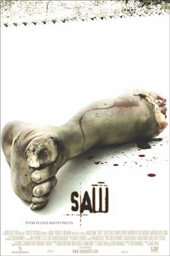
The Narrative Image for SAW
SAW is said to be one of the most terrifying horror movies of all time with some of the most gruesome and gory scenes ever made. However it has only earned this title since the release of the film back in 2004, but what enticed people to want to go and see it in the cinema was the narrative image it created.

The Poster
The poster has a very shocking CU image of a footthat has been severed off on it. It is in the middle connoting to the audience that it is extremely relevant to the film and the nature of the image immediately grabs the audiences attention.
The audience can tell straight away that it is a poster for a horror movie because of the blood around the foot which is normally linked with the horror genre and saw teeth running across the top of the poster which symbolizes a dangerous killing weapon, another common horror aspect. Also the fact that the hand is sawed right off shows that the film is going to include gruesome scenes, once again linked to the horror genre. This will therefore attract the horror movie loving audience which is what the directors would have wanted.
The background is very bright white and clinical. We normally associate white with purity and angelicness but due to the severed foot in the middle of the poster it makes the whiteness seem supernatural and disturbing. It gives the sense of emptiness and instead of thinking about an innocent thing you start to think about mental asylums and psychopaths as this is another instance where white is used in a more chilling way.
The title of the film is in a scary looking, blood red font. It ties in well with the image as it could be mistaken for blood from the hand and once again connotes the horror genre. It is a good anchor for the image because we can see the foot has been cut off and there are saw teeth but the title brings the two together and we immediately know that the hand has been cut off with the saw. However the title does not give away much of the film. It tells the audience that is going to involve a lot of blood as it is the name of a weapon but it doesn't tell us much more about it. This sets up an enigma as we want to find out more and why exactly the film is called 'SAW'.
The tagline 'Every piece has a puzzle' is mysterious in itself. It leaves the audience guessing as we know that puzzles are involved with mysteries so it means there must be something that needs to be solved. In a way it creates a puzzle for the audience to solve because they want to find out what the tagline is talking about and the only way to solve this puzzle is by going to watch the film.
The poster gives all the institutional information to the audience as well so they are able to know who directed the film, who is acting in it, what company are showing it, a website to find out more information etc. It can entice the audience to see a film if they like an actor or if the director has directed a film before that they have enjoyed. However these are not written in big writing showing to the audience that the film and story line are far more important and enticing the actors and director. It also does not tell you anything about the date it is released once again leaving the audience dying to know more.

The trailer sets the film up to be a horror movie as the images are very dark and creepy. It sets up the story but does not give too much away, creating an enigma that will leave the audience wanting to know what happens in the end and why the things occurring in the trailer are happening. It introduces us to the various characters that we will see throughout the film but does not tell us anything more than the basic background detail. We also find out very little about the killer except from CU shots of newspaper clippings and the voice over explaining things briefly from what they know. It gives us the background information but makes the audience want to go to the cinema to see the film so that they can understand the articles exactly and who and why the killer is doing what he does.
The trailer draws in the audience making them more involved with the film therefore making them want to go and see it. It uses titles effectively to do this as they are asking rhetorical questions to the audience and giving them an insight to different perceptions of the killer that might come across during the film.
It immediately grabs the audiences attention with the flashing picture imitating a camera flash alongside the noise that anchors this. It sets the story up to be chilling and unnerving and scares the audience into wanting to find out more.
It tells the audience the release date and title of the film but not until the very end. This means that it captivates the audience from start to finish as they have to watch the whole thing to find out exactly what they are watching. It creates its own questions that the audience can only find out the answers if they continue to watch the trailer.
At the start the pace is quite slow, explaining the background of the story slowly to the audience. Towards the end however the pace of the trailer increases with lots of quick cuts from shot to shot making it very choppy and quick. It is almost reflecting the desperation that the characters will experience throughout the film and how as the film goes on they become more desperate. This is also reflected by the background music that is mimicking the sound of a heart beat. It starts off at a fairly normal pace but as the trailer progresses it speeds up and becomes faster and faster. It is what you would expect the audience's hearts to be doing during the trailer and the film as it builds up suspense and terror as parts are left to the unknown. It is also showing you how the characters emotions and feelings change throughout the film, showing that they start of fairly calm and then slowly become more and more frightened.
The voiceover is a mixture of various characters from the film expressing vital emotions and important information. However the one that stands out the most is a very creepy, deep voice that you never find out who it belongs to. It draws in the audience and can be immediately linked with the horror genre. It is not a happy sounding voice or a girly voice indicating to the audience that it is going to be a very dark, depressing film. The audience can immediately tell that the voice over comes from the film as it is explaining information from their POV. This makes the audience interested as they want to find out who this menacing voice belongs to and why they are saying all the things they are saying.

Word of Mouth Endorsement
Before the film was released, many people had already begun talking about this new horror movie that was coming out. It set itself up to be truly terrifying and due to this many people were dying to go and see it to find out whether they could be brave enough to withstand it.
It was reviewed a lot by various magazines and newspapers before its release such as 'The Times', 'Rolling Stone' and 'The Guardian' all claiming that the plot is full of gripping twists and it is a horror movie like no other that will sure enough get you squirming in your seats. They compare it to films such as Se7en but claim it is far less mainstream as it does not contain 'pretty boy actors', referring to the likes of Brad Pitt. This would entice audiences to want to see it because Se7en was a huge success and many people did find it extremely eery and scary. However the fact that it does not contain many big names seems to be a selling point as it draws attention to the actual film rather than the actors involved, therefore making people want to go and see it more.
The fact that the reviews claim there to be lots of twists and guessing games makes the audience want to go to pay to watch the film to find work out these twists and find out more. It makes them question the things such as the poster and trailer because they set it up to be a traditional detective horror but with the announcement of a more quirky story line the audience are dying to find out what it is that makes it so original.

All of these elements create the suspense and excitement around the film that will make the audience want to go and pay to watch the film on the opening weekend. They producers and directors set up something that makes the audience want to be the first ones to find out the answers and work out the puzzle that is said to be apparent in this film and therefore they will pay to go and see it when it first makes it into the cinema. It built up a reputation from nothing, just by comparing it to previous successful horror movies and adding original and twisted plots that get the audience taste buds going. The producers do not have to force them to watch the film, nor do they have to tell them to watch it through their trailer. Instead they just promote their film in the way they feel will attract the right and biggest audience and this is the narrative image that they created to do this. It worked successfully as SAW was a big hit in the cinema with both horror movie lovers and non-lovers as it was sold the film as being something 'unmissable' and it spurred the making of 4 sequel films.