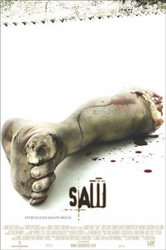
The audience can tell straight away that it is a poster for a horror movie because of the blood around the foot which is normally linked with the horror genre and saw teeth running across the top of the poster which symbolizes a dangerous killing weapon, another common horror aspect. Also the fact that the hand is sawed right off shows that the film is going to include gruesome scenes, once again linked to the horror genre. This will therefore attract the horror movie loving audience which is what the directors would have wanted.
The background is very bright white and clinical. We normally associate white with purity and angelicness but due to the severed foot in the middle of the poster it makes the whiteness seem supernatural and disturbing. It gives the sense of emptiness and instead of thinking about an innocent thing you start to think about mental asylums and psychopaths as this is another instance where white is used in a more chilling way.
The title of the film is in a scary looking, blood red font. It ties in well with the image as it could be mistaken for blood from the hand and once again connotes the horror genre. It is a good anchor for the image because we can see the foot has been cut off and there are saw teeth but the title brings the two together and we immediately know that the hand has been cut off with the saw. However the title does not give away much of the film. It tells the audience that is going to involve a lot of blood as it is the name of a weapon but it doesn't tell us much more about it. This sets up an enigma as we want to find out more and why exactly the film is called 'SAW'.
The tagline 'Every piece has a puzzle' is mysterious in itself. It leaves the audience guessing as we know that puzzles are involved with mysteries so it means there must be something that needs to be solved. In a way it creates a puzzle for the audience to solve because they want to find out what the tagline is talking about and the only way to solve this puzzle is by going to watch the film.
The poster gives all the institutional information to the audience as well so they are able to know who directed the film, who is acting in it, what company are showing it, a website to find out more information etc. It can entice the audience to see a film if they like an actor or if the director has directed a film before that they have enjoyed. However these are not written in big writing showing to the audience that the film and story line are far more important and enticing the actors and director. It also does not tell you anything about the date it is released once again leaving the audience dying to know more.
The trailer sets the film up to be a horror movie as the images are very dark and creepy. It sets up the story but does not give too much away, creating an enigma that will leave the audience wanting to know what happens in the end and why the things occurring in the trailer are happening. It introduces us to the various characters that we will see throughout the film but does not tell us anything more than the basic background detail. We also find out very little about the killer except from CU shots of newspaper clippings and the voice over explaining things briefly from what they know. It gives us the background information but makes the audience want to go to the cinema to see the film so that they can understand the articles exactly and who and why the killer is doing what he does.
The trailer draws in the audience making them more involved with the film therefore making them want to go and see it. It uses titles effectively to do this as they are asking rhetorical questions to the audience and giving them an insight to different perceptions of the killer that might come across during the film.
It immediately grabs the audiences attention with the flashing picture imitating a camera flash alongside the noise that anchors this. It sets the story up to be chilling and unnerving and scares the audience into wanting to find out more.
It tells the audience the release date and title of the film but not until the very end. This means that it captivates the audience from start to finish as they have to watch the whole thing to find out exactly what they are watching. It creates its own questions that the audience can only find out the answers if they continue to watch the trailer.
At the start the pace is quite slow, explaining the background of the story slowly to the audience. Towards the end however the pace of the trailer increases with lots of quick cuts from shot to shot making it very choppy and quick. It is almost reflecting the desperation that the characters will experience throughout the film and how as the film goes on they become more desperate. This is also reflected by the background music that is mimicking the sound of a heart beat. It starts off at a fairly normal pace but as the trailer progresses it speeds up and becomes faster and faster. It is what you would expect the audience's hearts to be doing during the trailer and the film as it builds up suspense and terror as parts are left to the unknown. It is also showing you how the characters emotions and feelings change throughout the film, showing that they start of fairly calm and then slowly become more and more frightened.
The voiceover is a mixture of various characters from the film expressing vital emotions and important information. However the one that stands out the most is a very creepy, deep voice that you never find out who it belongs to. It draws in the audience and can be immediately linked with the horror genre. It is not a happy sounding voice or a girly voice indicating to the audience that it is going to be a very dark, depressing film. The audience can immediately tell that the voice over comes from the film as it is explaining information from their POV. This makes the audience interested as they want to find out who this menacing voice belongs to and why they are saying all the things they are saying.
Word of Mouth Endorsement


Before the film was released, many people had already begun talking about this new horror movie that was coming out. It set itself up to be truly terrifying and due to this many people were dying to go and see it to find out whether they could be brave enough to withstand it.
It was reviewed a lot by various magazines and newspapers before its release such as 'The Times', 'Rolling Stone' and 'The Guardian' all claiming that the plot is full of gripping twists and it is a horror movie like no other that will sure enough get you squirming in your seats. They compare it to films such as Se7en but claim it is far less mainstream as it does not contain 'pretty boy actors', referring to the likes of Brad Pitt. This would entice audiences to want to see it because Se7en was a huge success and many people did find it extremely eery and scary. However the fact that it does not contain many big names seems to be a selling point as it draws attention to the actual film rather than the actors involved, therefore making people want to go and see it more.
The fact that the reviews claim there to be lots of twists and guessing games makes the audience want to go to pay to watch the film to find work out these twists and find out more. It makes them question the things such as the poster and trailer because they set it up to be a traditional detective horror but with the announcement of a more quirky story line the audience are dying to find out what it is that makes it so original.
All of these elements create the suspense and excitement around the film that will make the audience want to go and pay to watch the film on the opening weekend. They producers and directors set up something that makes the audience want to be the first ones to find out the answers and work out the puzzle that is said to be apparent in this film and therefore they will pay to go and see it when it first makes it into the cinema. It built up a reputation from nothing, just by comparing it to previous successful horror movies and adding original and twisted plots that get the audience taste buds going. The producers do not have to force them to watch the film, nor do they have to tell them to watch it through their trailer. Instead they just promote their film in the way they feel will attract the right and biggest audience and this is the narrative image that they created to do this. It worked successfully as SAW was a big hit in the cinema with both horror movie lovers and non-lovers as it was sold the film as being something 'unmissable' and it spurred the making of 4 sequel films.
 The poster has a very shocking CU image of a footthat has been severed off on it. It is in the middle connoting to the audience that it is extremely relevant to the film and the nature of the image immediately grabs the audiences attention.
 Before the film was released, many people had already begun talking about this new horror movie that was coming out. It set itself up to be truly terrifying and due to this many people were dying to go and see it to find out whether they could be brave enough to withstand it.
0 comments:
Post a Comment